Context
Our client is a company that provides clear aligner treatment to patients.
They wished to create an app where patients would be able to undergo clear aligner treatment remotely with a dental professional.
They hoped that more patients would be inclined to sign up for their services if the app had the following features:
- Before and After Imaging: where users can take a photo of their current teeth and see a visualisation of their future teeth after having treatment.
- To have an initial virtual consultation with a dental professional.
- To book appointments with a dental professional.
- To communicate online with their dental professional.
User & Business Goals:
Our client’s goal was to create a product that would enable remote clear aligner treatment and increase their conversion rate for potential customers. The user goal was to sign-up and start their clear aligner treatment with our client. If the goals have been met, our client would have more potential customers booking a first appointment and improve their brand reputation. For users, they would finish their treatment and achieve straighter teeth.
My role:
My role involved defining the business's needs and goals, preparing a research plan and undertaking user research, analysing insights from our users, creating personas, developing a user journey map, information architecture, wireframing (both low fidelity and high fidelity), prototyping, and usability testing. I also presented insights and pitched solutions to stakeholders and clients.
1. Research Approach
1.1 Who are our clear aligner users?
Before setting out to do our research, our assumptions of our potential users were that:
- Users found onboarding with a clear aligner company confusing, circuitous and frustrating.
- Users would want to know the cost up front, given the significant expense of treatment.
- Users are uncertain about the product being effective.
- Users want convenience during the treatment process.
- Users want to see a dentist to feel confident that treatment they are receiving is effective and not damaging to their teeth.
- Depending on life stage, users will prioritise different considerations when researching clear aligner treatment.
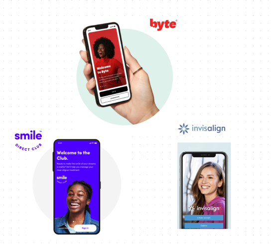
1.2 Competitor analysis and desktop research🏋️♂️
First, I analysed a few of the company’s successful competitors (such as Byte, SmileDirectClub & Invisalign), who had created apps that enabled remote clear aligned treatment.
These apps possessed a range of features, enabling the user to do the following:
These apps possessed a range of features, enabling the user to do the following:
- take photographs of their teeth to send to dental professionals;
- message their dental professionals;
- Measure their progress (such as countdowns) that motivated the user to comply with their treatment.
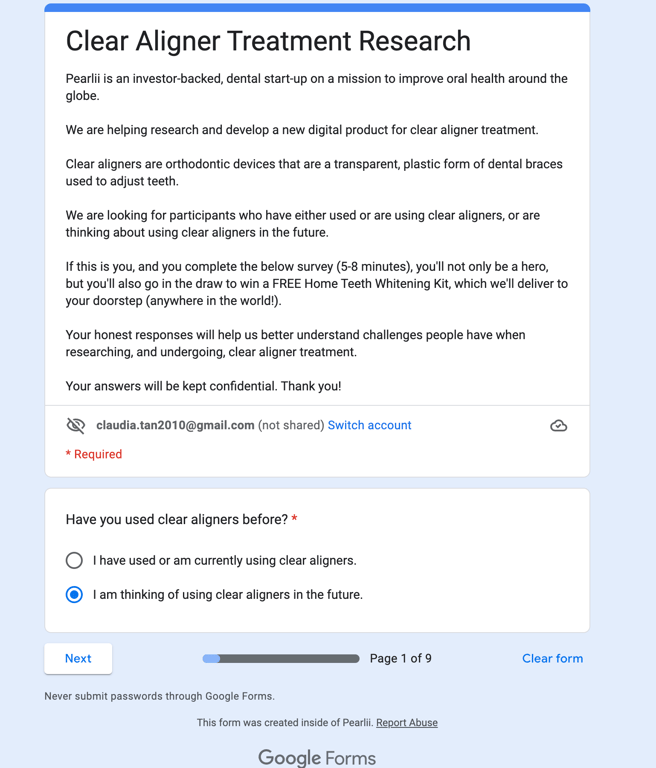
1.3 Sending out surveys to users✍️
Considering our target audience of people undergoing clear aligner treatment or considering treatment, I co-crafted a survey with a series of multi-choice and short answer questions.
We posted the survey to clear aligner forums on the internet where our target audience would frequent.
Our survey received 50 responses. The full list of questions can be found below:
Survey questions for Clear Aligner PatientsWe posted the survey to clear aligner forums on the internet where our target audience would frequent.
Our survey received 50 responses. The full list of questions can be found below:
- Demographics of our potential users (e.g. age, occupation, life stage)
- Why did you want to get clear aligners?
- What factors were most important to you when choosing a clear aligner product? (e.g. cost, results, duration of treatment, remote check-ups, in-person check-ups)
- What brand of clear aligner did you choose? and why?
- What was your experience going for check-ups?
- How important was knowing the cost of treatment upfront? (Not important at all, not important, important, very important)
- How important was knowing the length/duration of treatment upfront to you? (Not important at all, not important, important, very important)
- How important is seeing an image of how your teeth could look after treatment? (Not important at all, not important, important, very important)
- Would a side-by-side analysis of different clear aligner brands be useful to you? (Not useful, Not useful, Useful, very useful)
- What other factors would you like to have been made aware of before booking your first consultation?
- During your treatment, how would you prefer your ongoing check-ups? (In-person, Remotely, Both)
- Would a phone app for remote check-ups during your treatment be useful for you? (Not useful, Not useful, Useful, very useful)
- For remote check-ups, how would you like to communicate with your doctor (Tick all that apply: video-call (web), video call (app), online messaging, sending photographs of your teeth)
- What would be your preferred way to book a check-up appointment? (Phone call, website, app)
- How would you remember when your check-up appointments are? (physical diary, digital calendar, phone reminders)
1.4 Interviews with patients 💬
To truly understand a clear aligner patient’s mindset, we organised interviews and crafted a script.
Remote video-calls were done with 8 participants who either responded through our surveys or personal contacts who fit our criteria.
A full interview script found be found here:
User Interview Script (Clear Aligner users) (1)- To get started, could you please tell me a little bit about yourself?
- Location
- Occupation
- Hobbies
- Initial questions:
- Are you currently using clear aligners?
- Why did you decide to use clear aligners?
- Did you have any concerns before undergoing clear aligner treatment?
- Brand questions
- In your survey, you mentioned you use (xx) - is that correct?
- How did you find out about xx?
- What were your initial impressions before starting treatment?
- (how was the onboarding process?)
- What do you like about this brand?
- Is there anything you dislike about (brand)?
- Did you research any other brand clear aligners? If so, how?
- A few questions about your clear aligner treatment experience.
- What aspects of your treatment do you like?
- What aspects of your treatment don’t you like?
- How do you think these aspects could be improved?
- How does visiting a dentist or orthodontist make you feel?
- Are you aware of the invisalign app?
- Have you ever had a remote check-up with a dentist (for any type of dentist check up)? (if no, go to next question)
- Did you have any struggles with this? What happened? [for participant who did NOT have any online communication or consultations with their dentist, skip this question]
- How would you feel using a mobile app for remote check-ups/getting dental advice from your dentist?
- What do you care about the most during remote monitoring? Why?
- Is there anything you are hesitant about regarding remote monitoring?
- How do you feel about your smile and teeth now?
- Do you have anything else you would like to add?
2.Research Findings
Our research confirmed a lot of our assumptions and uncovered new insights of clear aligner patients’ thoughts and behaviours throughout their treatment.
Some of the main insights were that:
Patients desire clear communication with their dentist (or company representative) and needed to have trust and confidence in their dentist to feel comfortable with treatment.
Patients value the flexibility and convenience of being able to have remote treatment options as well as face-to-face appointments.
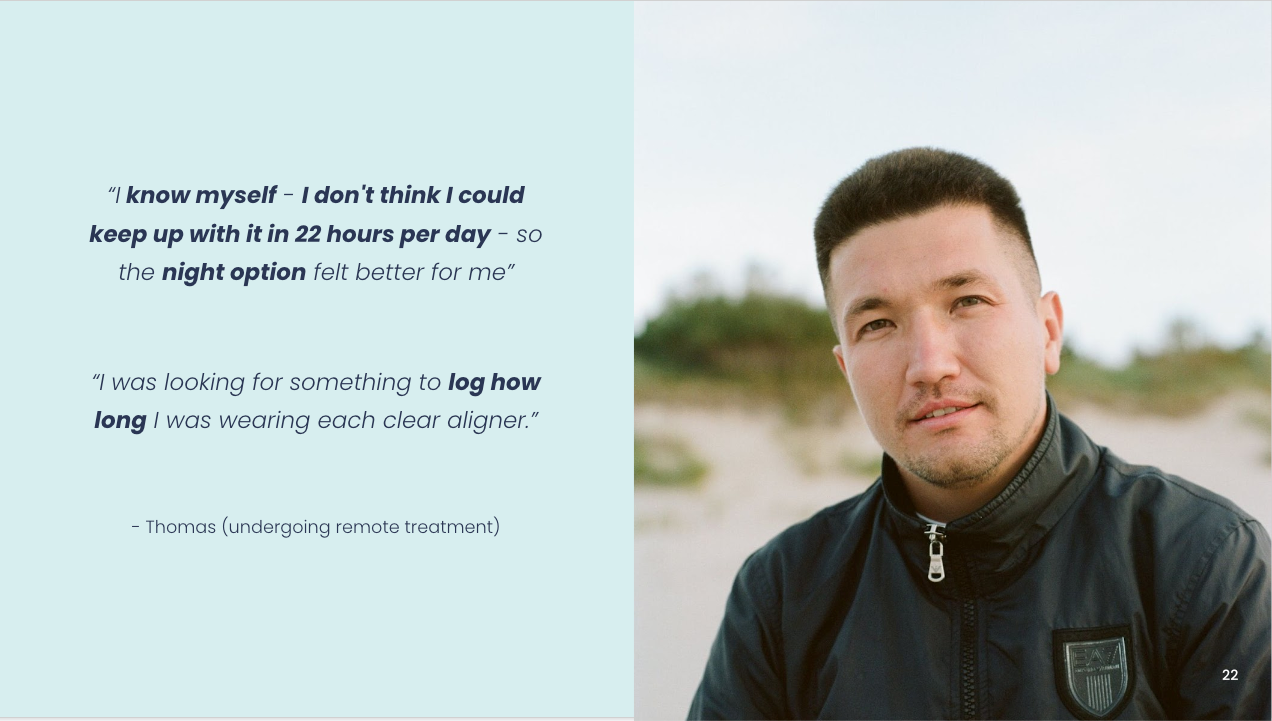
Patients struggled with self-discipline to wear clear aligners for the full 22 hours per day, resulting to delay the course of their treatment.
Patient who have undertaken some form of remote monitoring of their clear aligner treatment generally had a positive experience and majority (68% of participants) would find an app useful for remote monitoring.
Influencing factors for users when choosing a brand include their dentists’ recommendation, brand reputation and online reviews. Users considered factors such as visual results, duration and cost.
When onboarding with a clear aligner brand, majority (90% of participants) desired to see a simulation of their future smile.
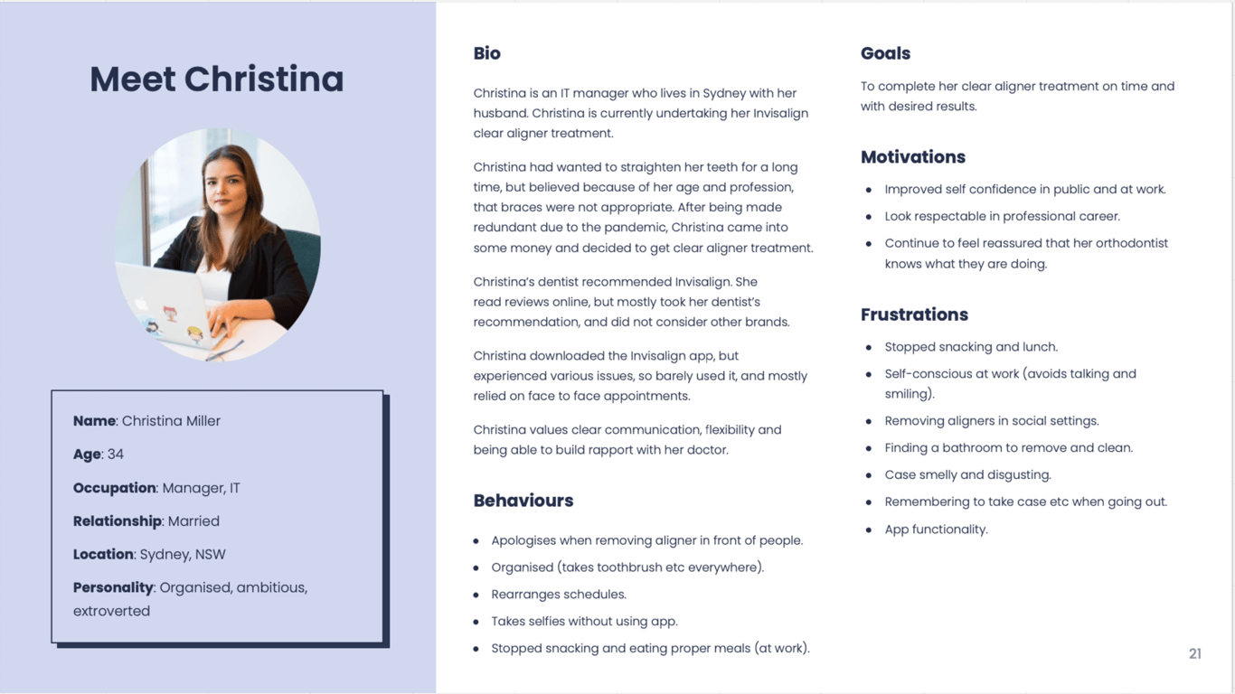
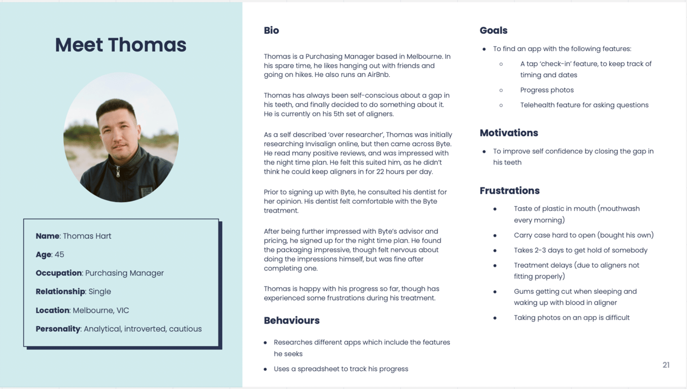
2.1 Personas
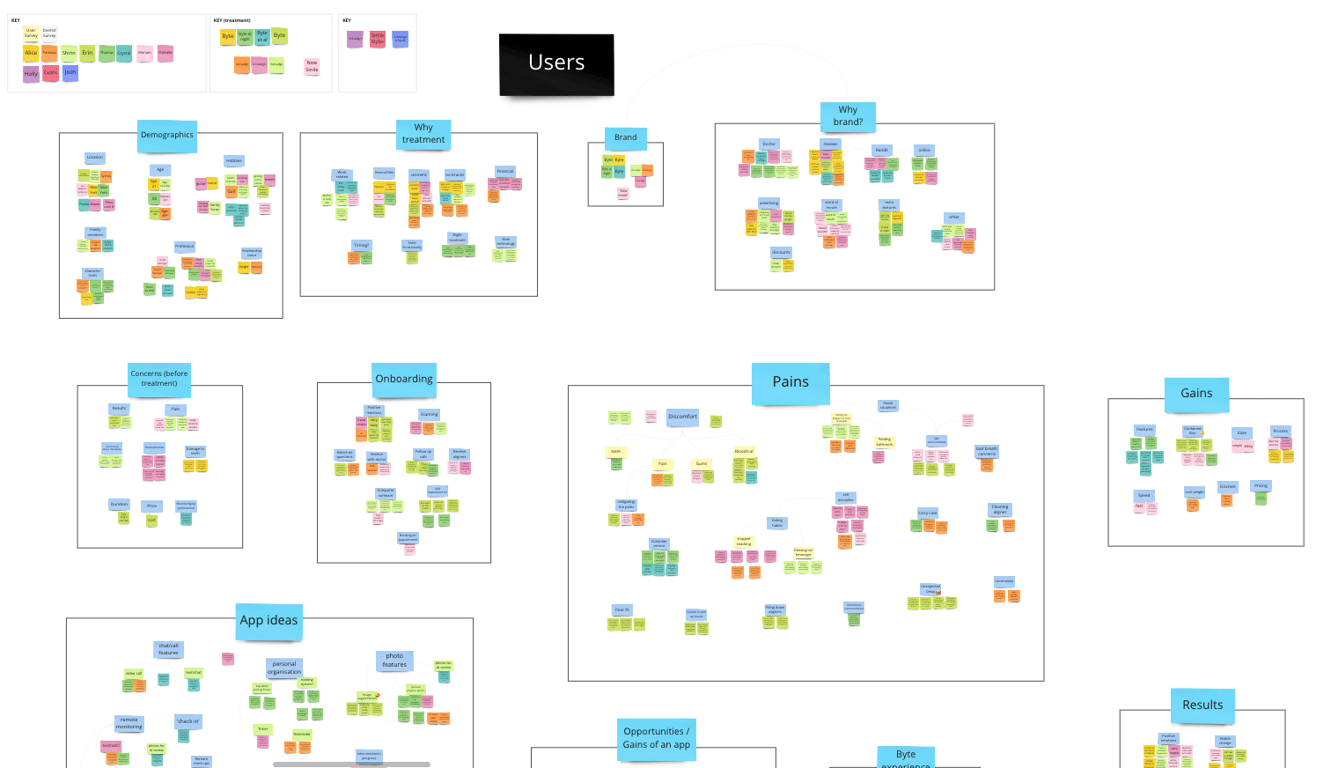
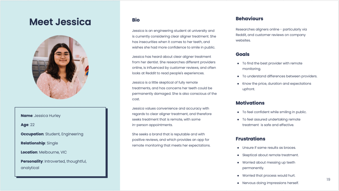
From our data, my colleague and I created 3 user personas to help my team further understand our users better.
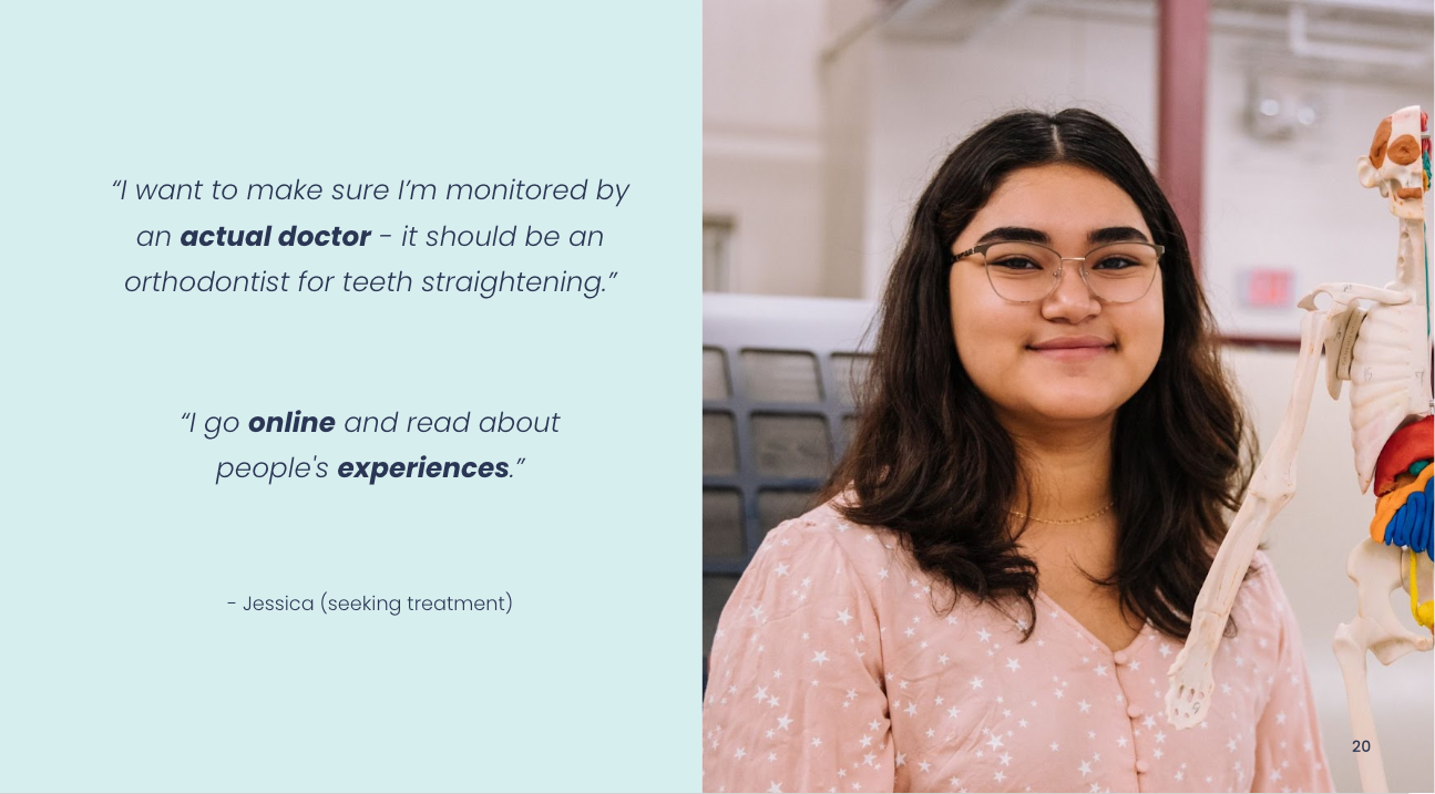
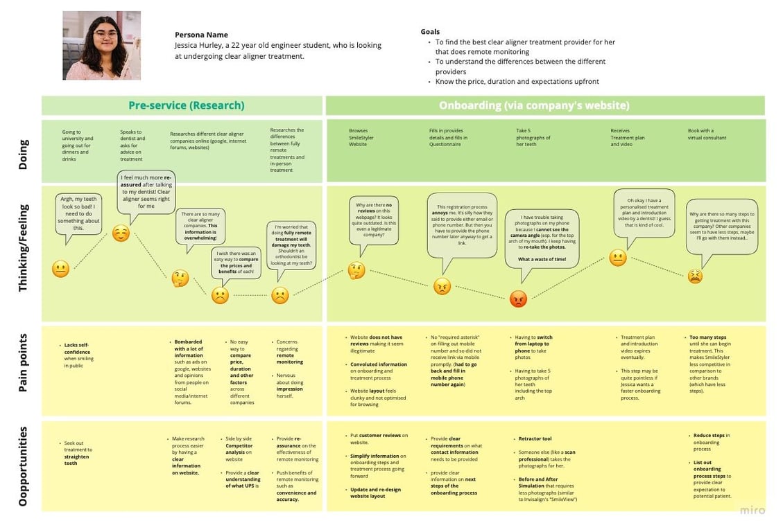
Persona 1: Jessica - seeking clear aligner treatment
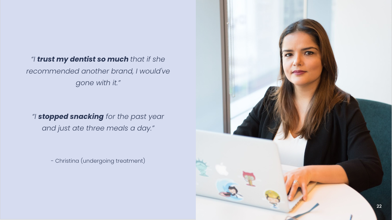
Persona 2: Christina - undergoing clear aligner treatment (in-person)
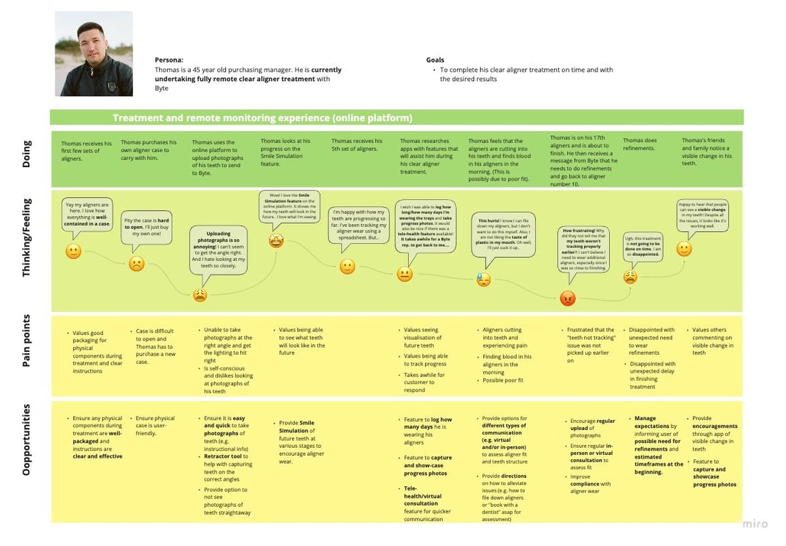
Persona 3: Thomas - undergoing clear aligner treatment (remotely)
2.2 User journeys
My colleague and I also created customer journey maps for our personas to help my team understand our user’s actions, thoughts and frustrations (such as difficulties finding information while researching treatment options or struggling to be motivated to wear their clear aligners) before and during treatment.
Using this, we also brainstormed and identified opportunities where we could alleviate any frustrations.
2.3 The real problem(s)
Based on our insights, we summarised the two real problems that patients faced:
Patients researching treatment, who desire/need to find out important information (such as cost, duration and potential teeth results), are frustrated that they do not have easy access to this information. As a result, a patient loses interest in signing up for treatment.
Patients undergoing treatment, who desire straight teeth, do not always have the time to make/attend in-person appointments or may sometimes be unmotivated to wear their clear aligners. As a result, patients are not able to achieve the results they want within their expected timeframe.
Our Solution: A Patient-Focused App
3. Creating our Product
3.1 “How might we..”
Based on our problem statement, we came up with the following questions to help direct our ideation phase:
How might we show the user how their teeth will look following treatment, so that they will be incentivised to sign-up with our clients’ services?
How might we motivate the user stay on track with their daily clear aligner wearing schedule so that they can achieve their desired results on time?
How might we help the user remotely communicate with their doctor so they can be re-assured their teeth are moving correctly?
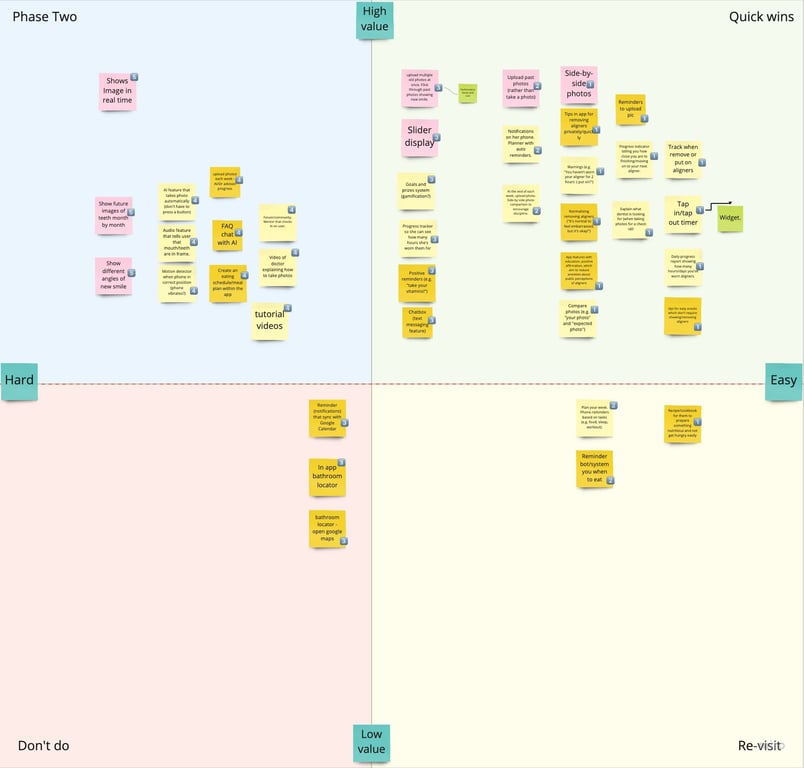
3.2 Brainstorming and sorting ideas
Through brainstorming sessions with engineers, UI designers and marketing professionals, we came up with many ideas to try to answer our users’ problems.
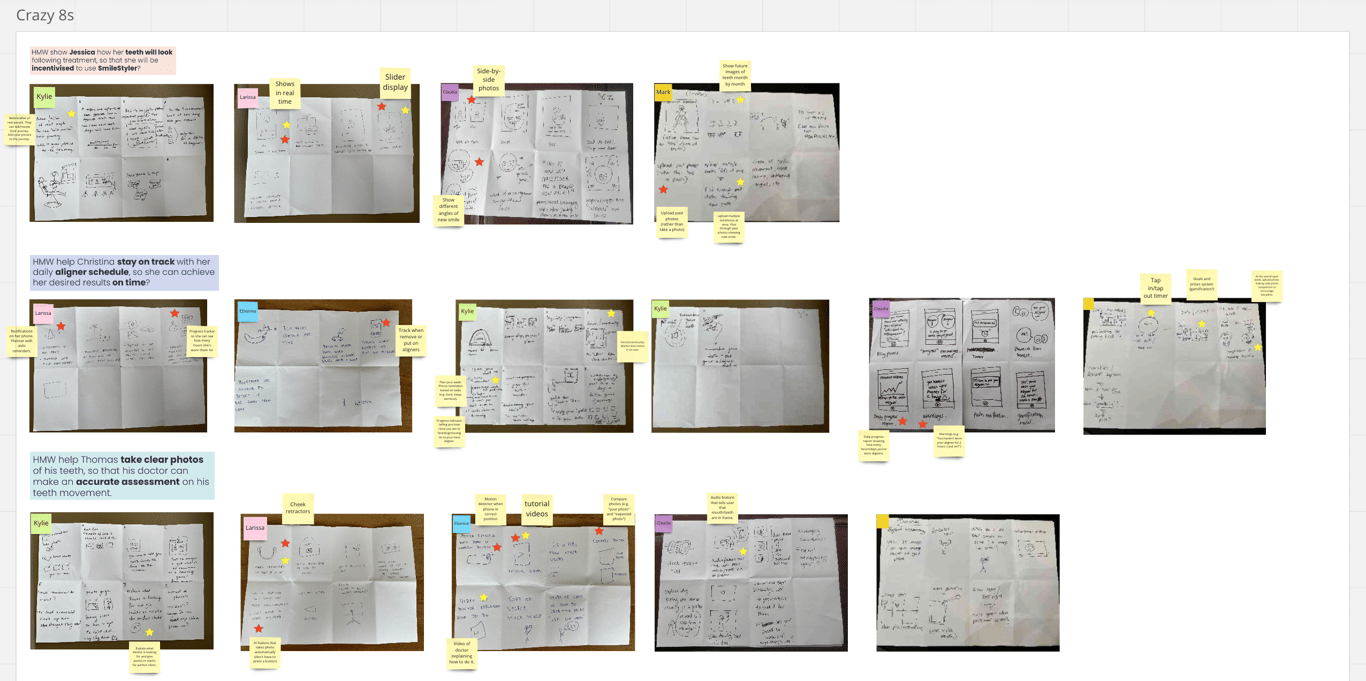
Working with engineers, we selected and prioritised features that would be most feasible from a technical perspective and aligned with our client’s goals.
3.3 Getting the structure right
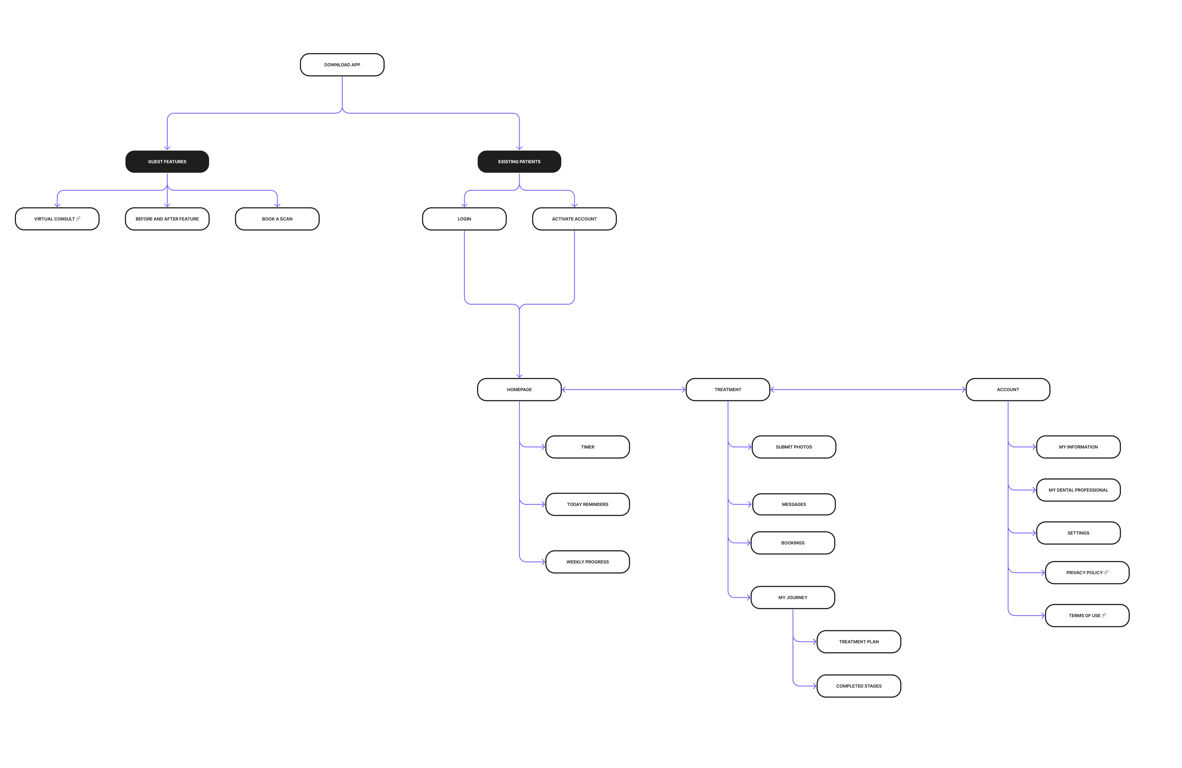
I created an Information Architecture map and user flows to understand, from a “birds-eye” view, how the app would be structured.
3.4 Designing screens
Working with a UI designer using Figma, we created low fidelity and mid-fidelity wireframes, laying out the content of each screen and seeing how these screens would interact with each other within a particular flow. Many design iterations were created of during this process.
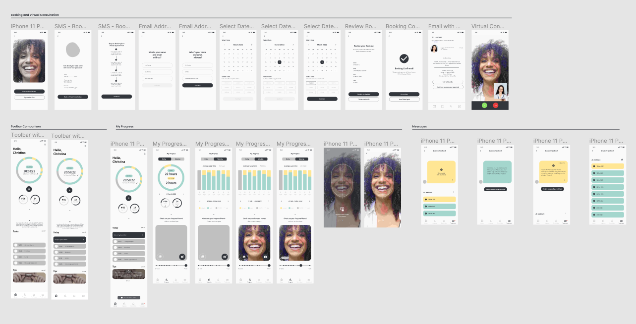
At the high fidelity stage, I worked with a UI designer to apply our client’s branding and visual imagery to the wireframes.
4. Delivering the final product
These were some of the main solutions we designed in the app.
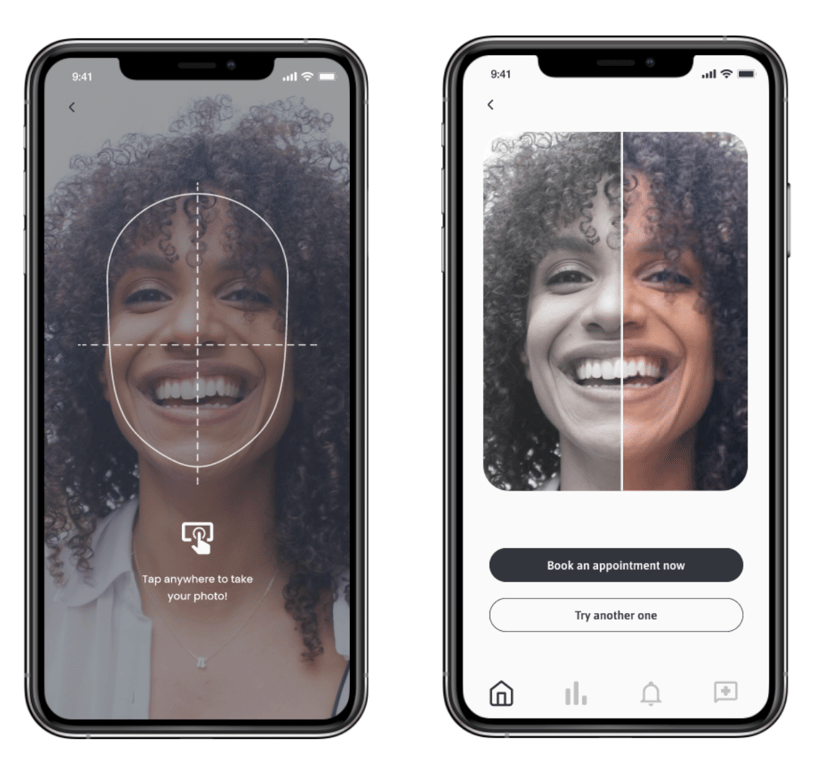
4.1 Before & After Simulation
- Based on our research, 90% of our users desired to see a before & after simulation of their teeth.
- We designed a feature that would enable users to take a photograph of their teeth. With AI technology (that was provided by an AI engineer), they will be able to view a simulation of their teeth after clear aligner treatment.
- After seeing a picture of their future teeth, users are led to book an appointment.
- By making this a “free” feature for potential clear aligner patients, this aligned with our client’s business goals to generate leads by incentivising new patients to book their first appointment with the company.
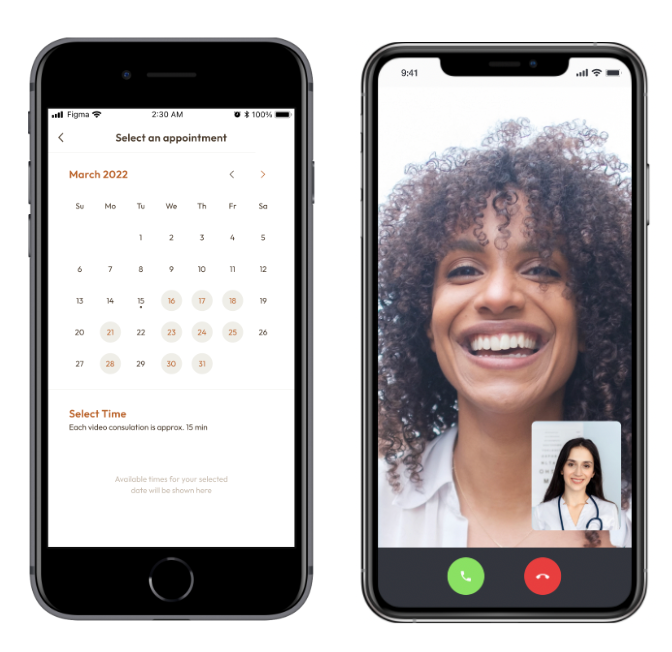
4.2 Booking system
- After viewing a future version of their teeth, users can easily book a free virtual consultation with a representative from our client’s company for any further questions.
- As users often wanted to know answers to their initial questions, such as the upfront cost and duration of their clear aligner treatment. This booking feature would provide them with easy access to a representative who could answer all their questions.
- This would assist in aiming to meet our client’s business goal of converting potential customers.
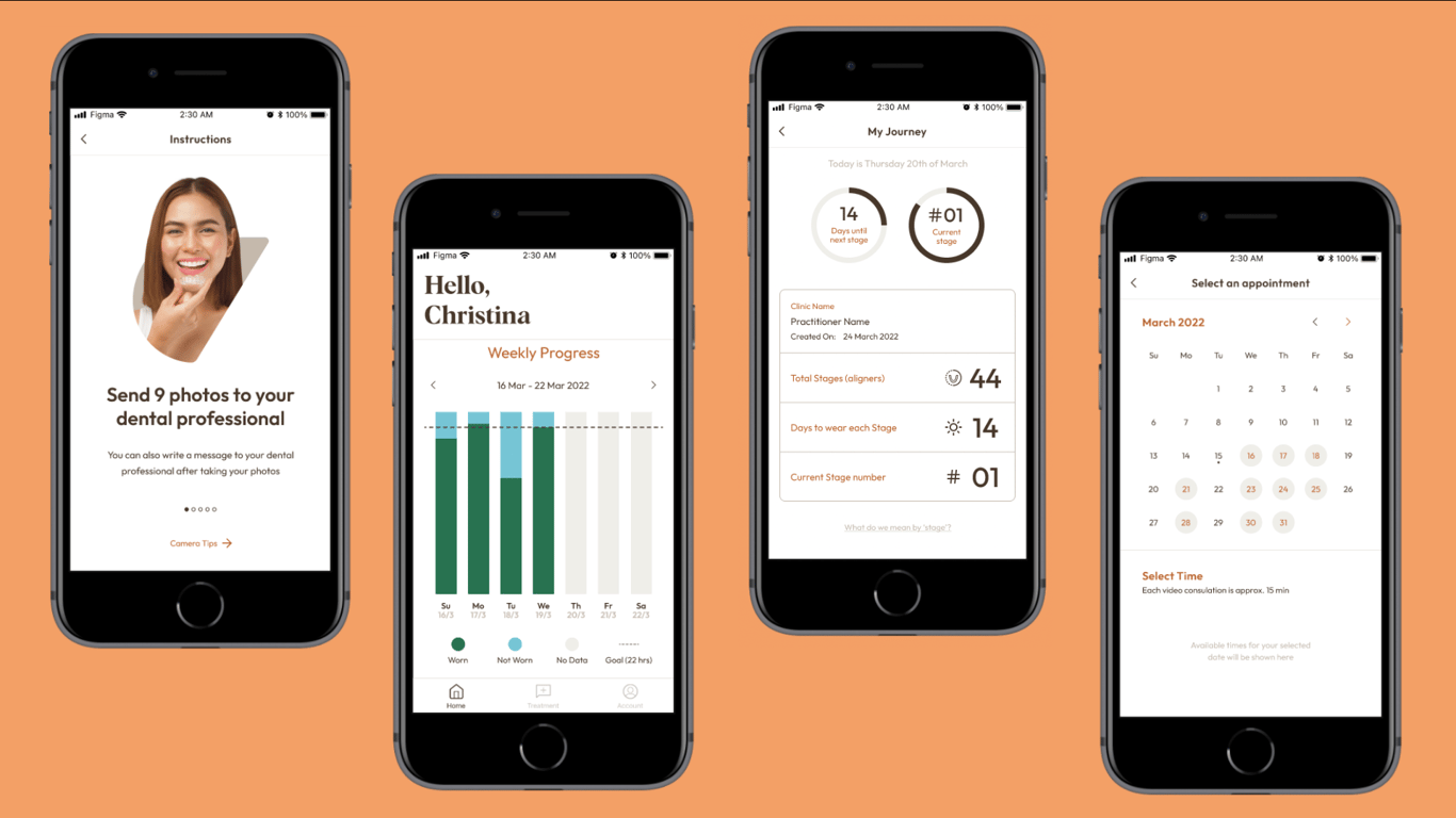
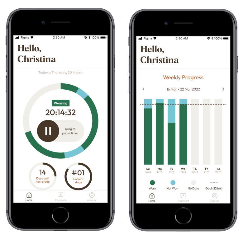
4.3 Motivation through progress indicators
- A frustration that users had during clear aligner treatment was lacking the self-discipline to wear their aligners for the full 22 hours.
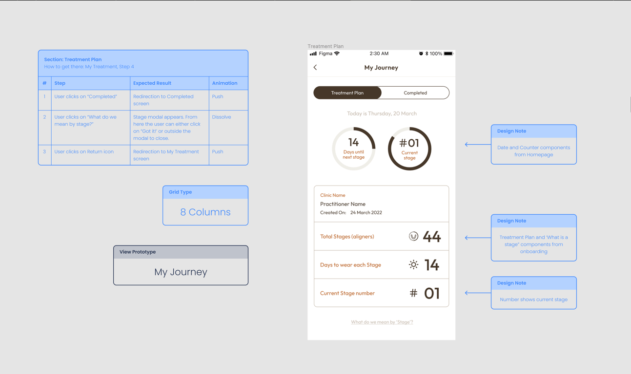
- To help alleviate this user frustration, we designed a timer feature to encourage consistent daily clear aligner wear, where users could track how long they wore their clear aligners and how long they did not wear them.
- Users would be able to track how long they’d worn their on a weekly basis, with the goal of wearing them for 22 hours per day.
- The ‘Days until the next stage’ and their current stage (I.e. clear aligner) number are also displayed, providing an indication how long more they need to wear their current aligner before they could progress to the next clear aligner.
- This aligned with our client’s goals of ensuring that patients wore their clear aligners regularly enough to see positive results for their teeth, which in turn would improve our client’s brand reputation within the clear aligner market.
4.4 Communication and support from dentist
- From our research, users valued having trust and confidence in their dentists and desired clear and easy communication with them. To ensure that these expectations were met, we designed the following elements.
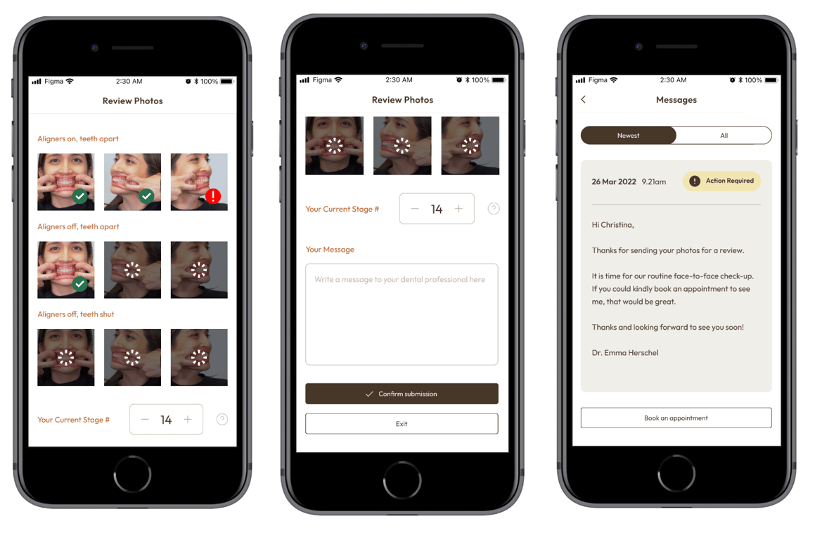
- In the app, patients are able to take 9 photographs of their teeth for the dentists to assess their progress.
- Patients are also able to write messages to explain any issues or concerns to their dental professional.
- When dentists respond to their message, a patient is able to easily book an appointment if they wished to speak directly with their dental professional.
- This would help the company to ensure that users remained satisfied with their customer service.
5. Handing over to engineers
It was time to handover the design file to the engineers. For each screen, we provided handover notes and annotations to our developers. This ensured that they understood the interactions that occurred on each screen and were able to build the product accurately according to our designs.
🎯Impact
- Although this app is not live on the app store yet, we fulfilled all project deliverables within our given timeframe.
- We had extremely positive feedback from our client expressing they were excited to launch this app later this year (2023).
💭Reflections
- More usability testing needed: Due to time constraints, we were only able to do quick usability testing via a survey with a link to our Figma prototype. In future, more extensive usability testing of the prototype would be ideal.
- Communication is key: This was one of the first projects where I assisted with providing handover notes in our designs. I found that handover notes were extremely helpful to communicate designs to engineers, providing clarity on how elements within each screen would operate and interact.
 Made with Bullet